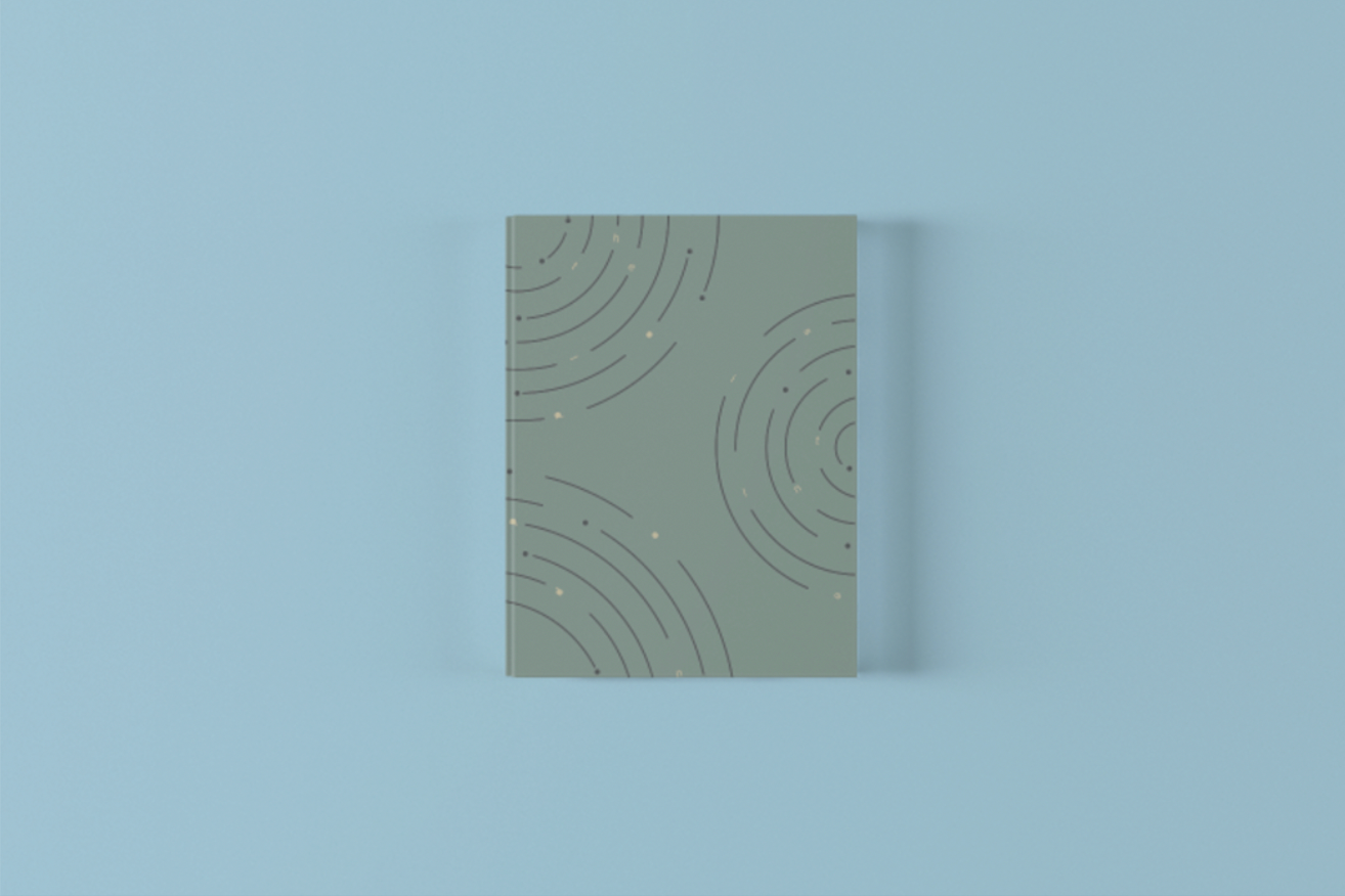
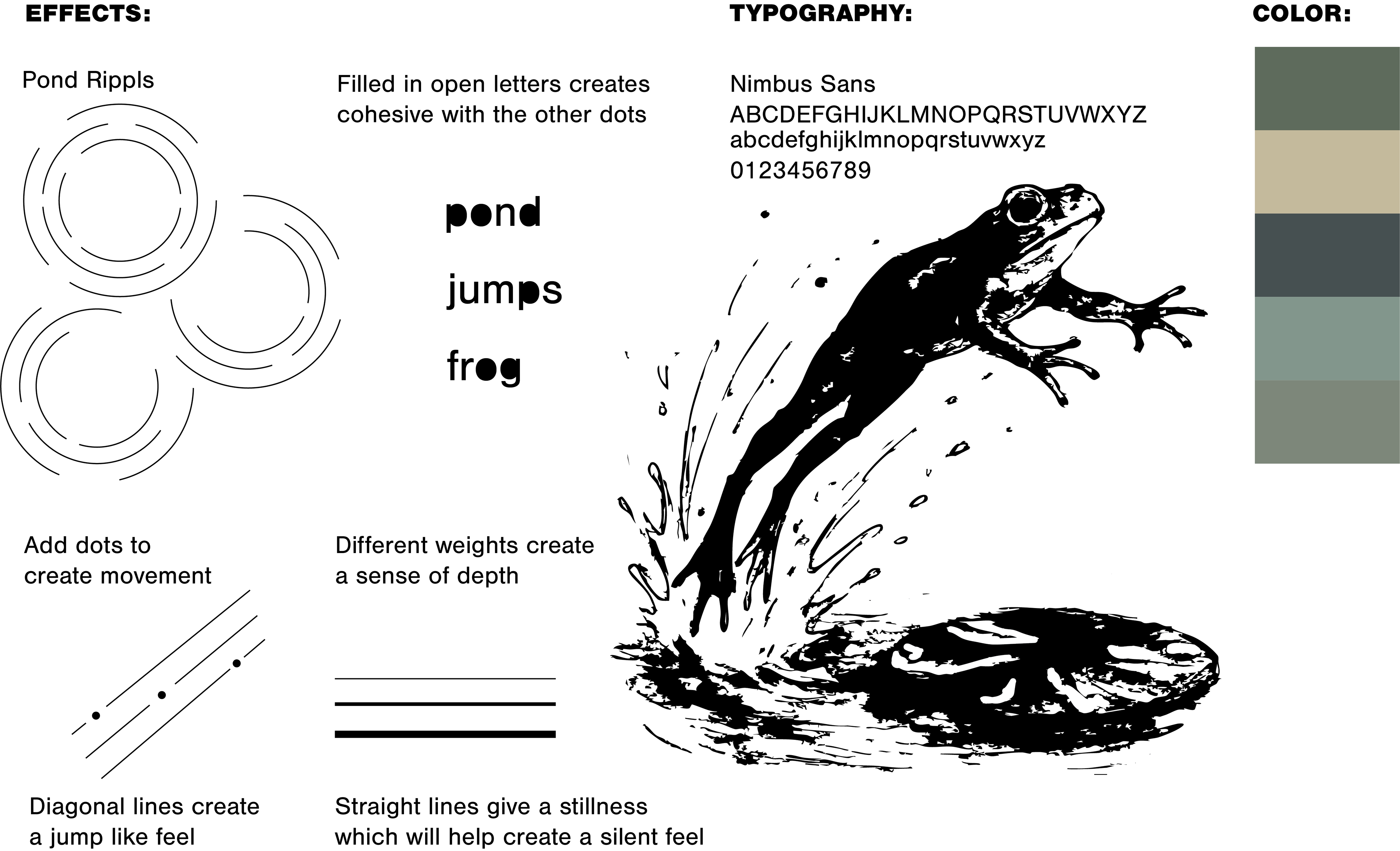
RESEARCH
The symbols and imagery used to accompany this haiku were intentionally limited to abstract interpretations created through the use of line, shape, and form. The selected colors, compositions, and visual elements were carefully chosen to evoke a sense of serenity, comfort, and wonder while maintaining a minimal and expressive aesthetic.
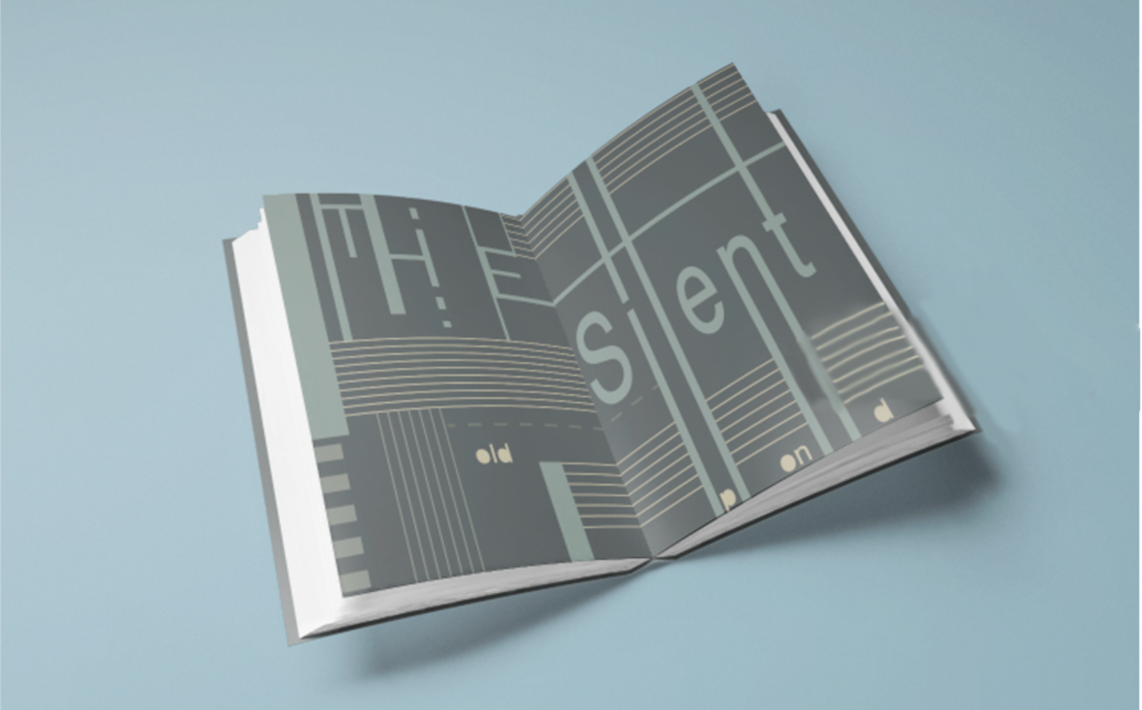
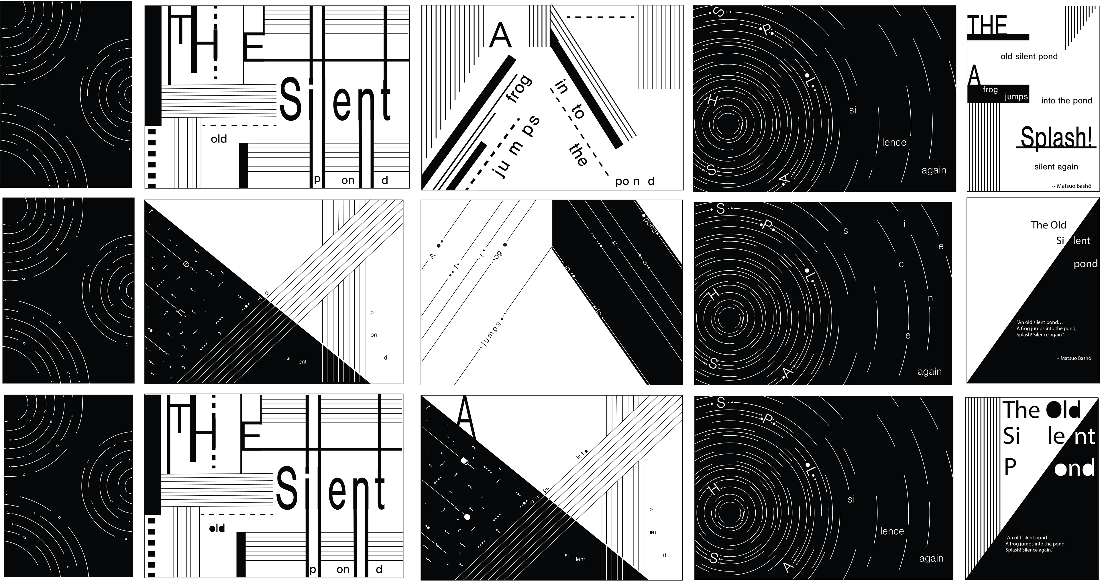
DIGITAL IDEATIONS
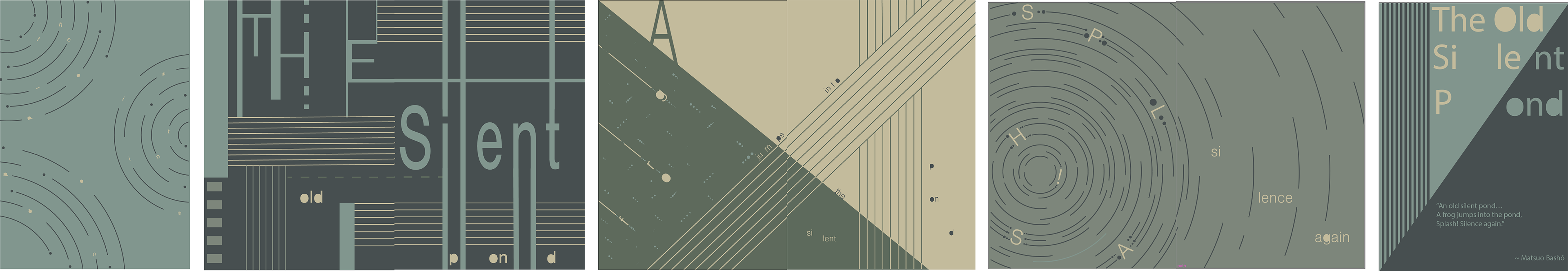
Digital ideations were developed to translate the abstract concepts explored in earlier sketches and physical experiments into refined visual compositions. Through experimentation with typography, color, shape, and layout, multiple digital iterations were created to explore how feelings of serenity, comfort, and wonder could be communicated within the final designs.
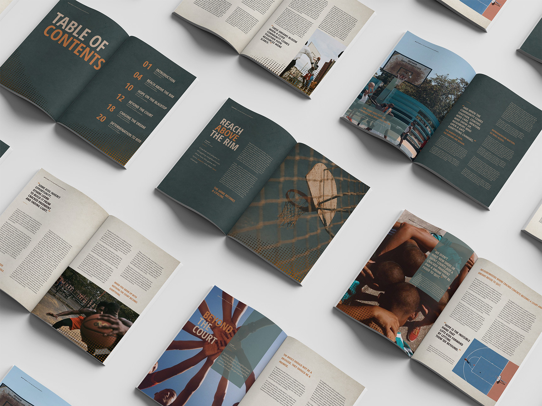
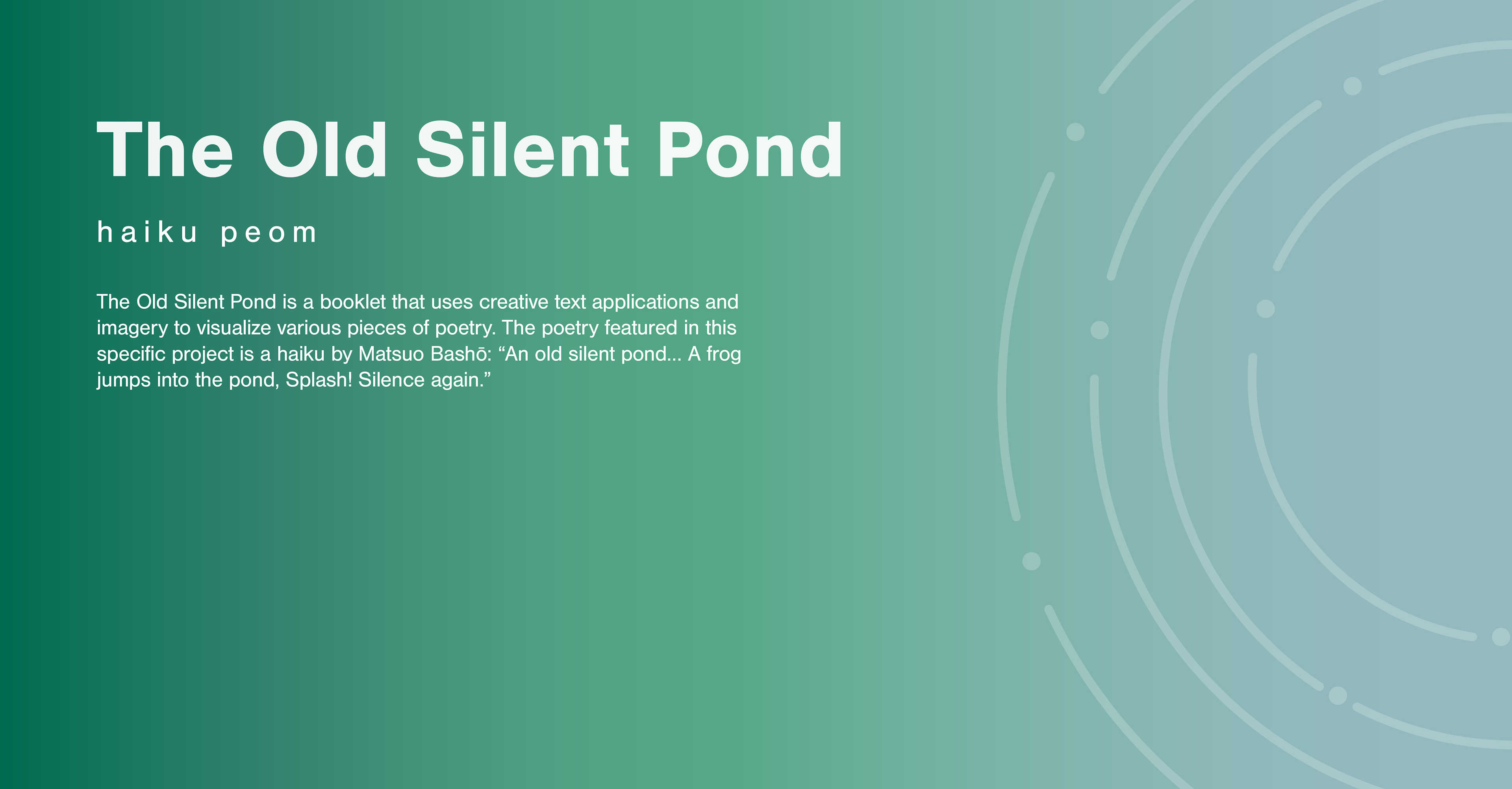
FINAL BOOKLET
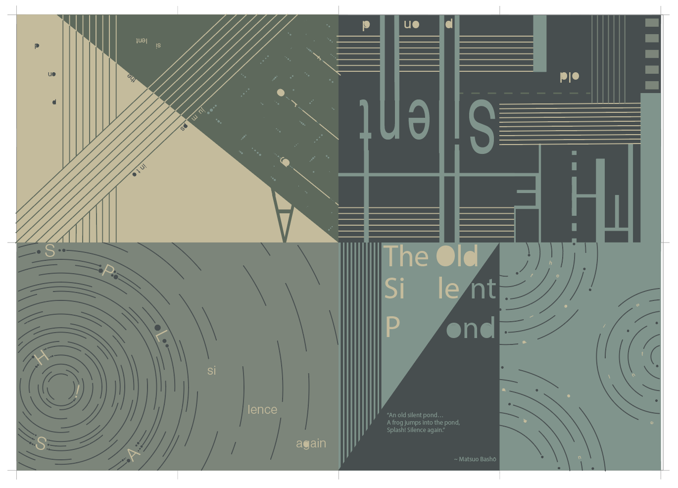
The final booklet brought together the refined visual language, typography, and conceptual elements developed throughout the design process into one cohesive and polished publication. Careful attention was given to layout, pacing, and overall composition to ensure the booklet effectively communicated the intended themes while creating an engaging and visually unified reading experience.
BOOKLET PRINT LAYOUT
BOOKLET APPLICATIONS