THE WORDMARK
The wordmark for goal combines a sense of seriousness with an underlying feeling of hope for those who are under resourced and forced to make the most of what they are given. It reflects the determination, resilience, and ambition of a community coming together to pursue dreams through sport. Balancing rawness with optimism, the mark establishes the foundation for the publication’s typographic voice one that feels bold, authentic, and aspirational.
RESEARCH
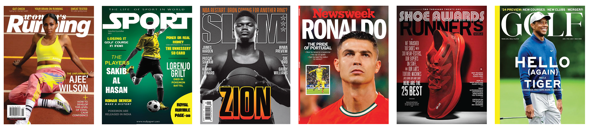
Research was conducted into existing sports publication wordmarks to better understand common visual styles, typography, and brand positioning. The objective was to develop a wordmark that feels established and trustworthy while also communicating hope, accessibility, and empowerment for under-resourced audiences.
CONCEPT STATEMENT
An explanation defining the overall theme and vision of the publication was developed and refined through multiple iterations. This statement served as a constant point of reference throughout the design process, ensuring the wordmark consistently and accurately conveyed the intended message, tone, and identity.
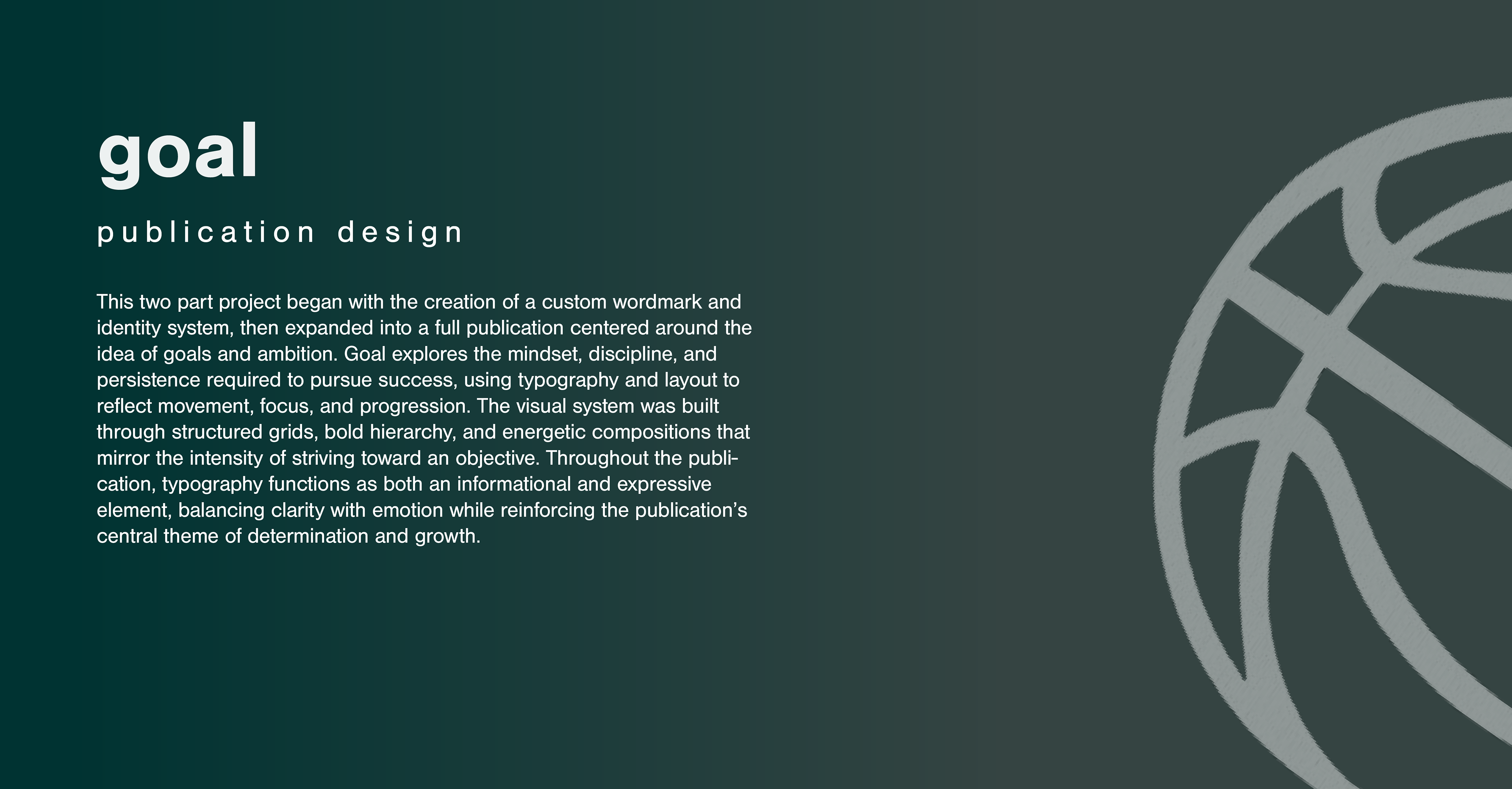
goal is a bold declaration of resilience and ambition, capturing the raw struggle and unbreakable hope of youth in poverty as they transform cracked courts, rusted goalposts, and the rhythm of survival into a powerful expression of identity through sport.
Conceptual directions were then established to help guide the visual development of the wordmark. These keywords were continually referenced throughout the ideation process to ensure each exploration moved toward a clearer and more cohesive representation of the publication’s overall theme and message.
Raw ,serious, bold, gritty, ambitious, hopeful, driven
TYPOGRAPHY EXPLORATION
Typography was explored across a variety of sources, including Adobe Fonts and Google Fonts, to better understand different typographic styles, structures, and visual tones before transitioning into hand drawn ideations and sketch exploration.

SKETCHING EXPLORATION
Based on typefaces discovered during the typography exploration phase, tracing paper was used to modify and refine the original letterforms. The intent was to push the typography closer to the publication’s overall theme, creating a wordmark that more effectively reflected its tone, energy, and message.

REFINED SKETCHING
After narrowing in on the black weight of the typeface Armada, another round of sketching was completed to explore the use of serifs, angled forms, and variations in weight.

DIGITAL ITERATIONS
The sketches were then moved into Adobe Illustrator and iterated upon digitally. The letter “l,” in particular, underwent several refinements to create curves and edges that more closely matched the visual language of the other letters.
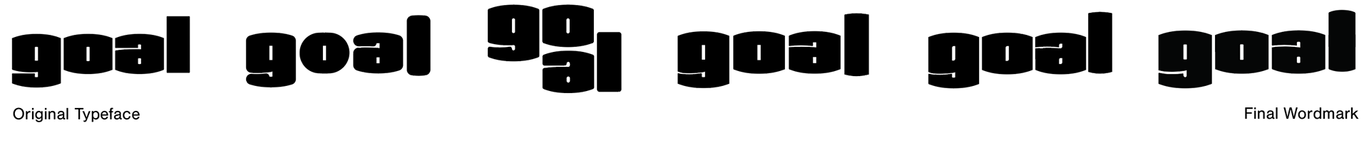
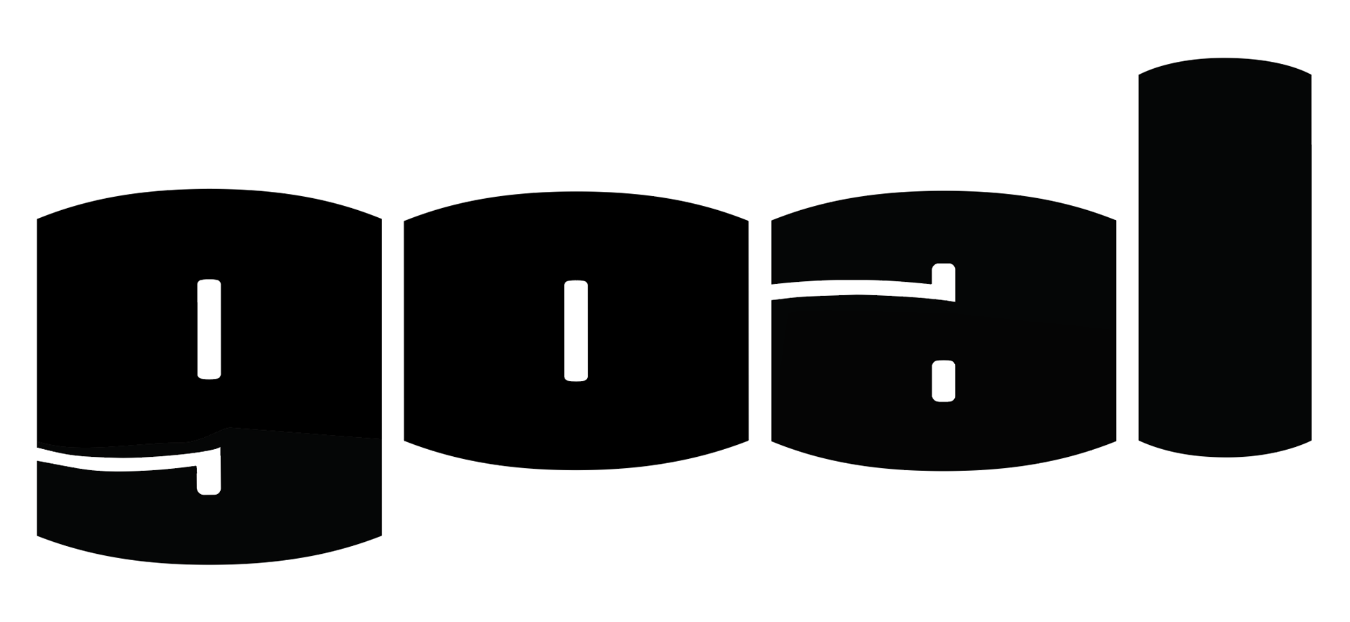
FINAL WORDMARK
THE PUBLICATION
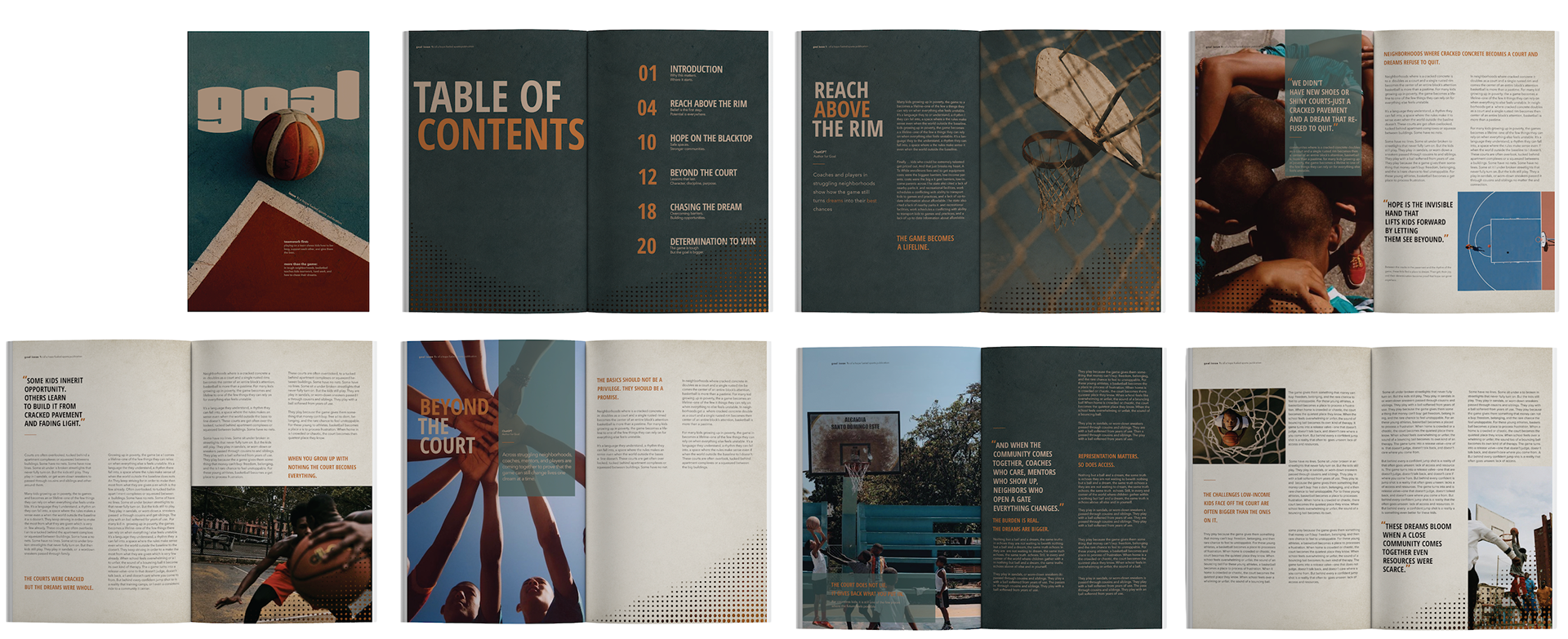
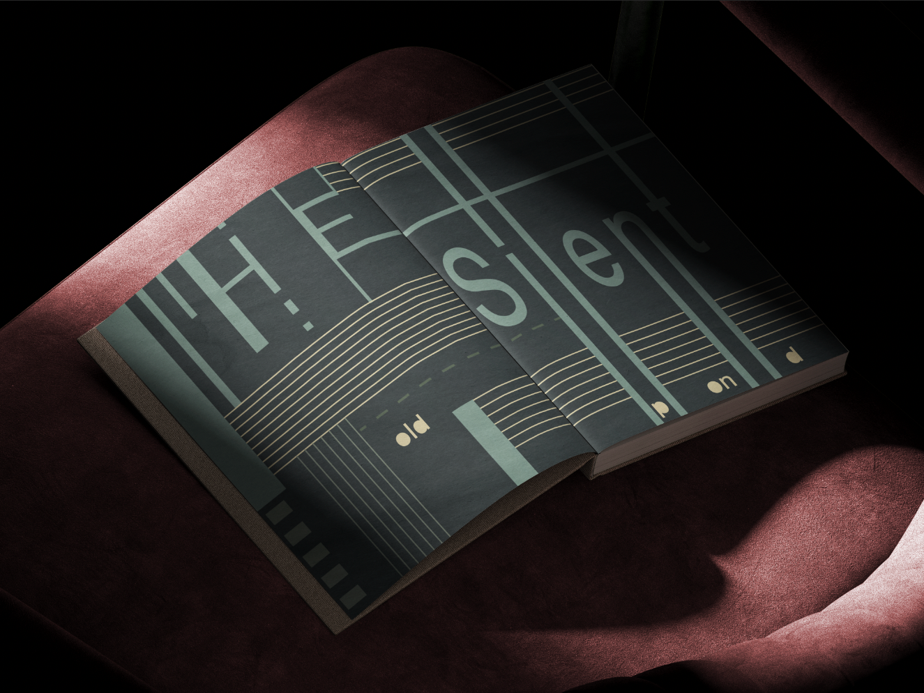
The development of goal was an iterative process shaped through experimentation and refinement. Early explorations focused on typography and imagery that reflected both the hardships of poverty and the resilience found through sport. As the system evolved, global and local rules guided the relationship between text, photography, and composition across spreads. The Result is a bold publication that captures the struggle, ambition, and hope of youth transforming sport into an expression of identity and resilience.
FINAL LAYOUTS
The completed spreads bring together refined typography, structured grids, and dynamic imagery. The final publication balances clarity with expression, embodying the resilience, ambition, and emotional intensity of youth finding identity and hope through sport.